Lessons · Lesson 2 of 6
The average that hides the morning
Show that two days with the same efficiency figure can need two completely different responses, and add the one extra number that brings back what the average destroyed.
Lesson 2 of 6 · 19 min
Two days that are the same number
Line 6 sews VB-4120, a long-sleeve poplin shirt for Vantbrook, on purchase order VBK-7318. Forty-four operators. Four hundred and eighty attended minutes in a shift. The standard minute value, or SMV — the work content of one shirt, in minutes of one operator's time — is 22.0 minutes. If the line lost nothing at all it would make 120 shirts an hour.
Halewatte's target for the line is 82.0%, and the daily report flags anything under 78.0%.
| Hour | Tuesday | Thursday |
|---|---|---|
| 07:30 | 96 | 105 |
| 08:30 | 96 | 105 |
| 09:30 | 96 | 105 |
| 10:30 | 96 | 33 |
| 11:30 | 96 | 105 |
| 12:30 | 96 | 105 |
| 13:30 | 96 | 105 |
| 14:30 | 96 | 105 |
| Day | 768 | 768 |
Both days made 768 shirts. So both days are 768 multiplied by 22.0, divided by 44 operators times 480 minutes: 80.0% exactly, on both days. Both days passed the daily check. Both days appear in the Monday sheet as the same row.
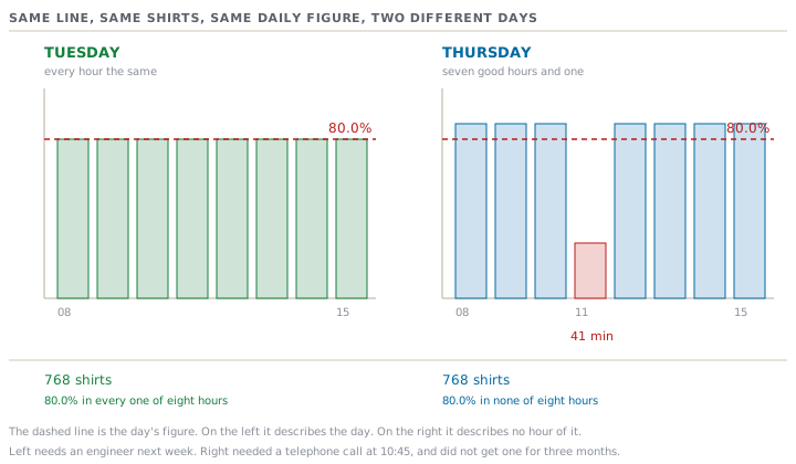
They are not the same day, and they do not have the same answer.
What each day is actually telling you
Tuesday ran at 80.0% in every single hour. Nothing broke. The line is simply slower than it is planned to be, all day, every hour, by an even margin. That is a balance and staffing question. Somebody has to sit with the operation times, find where one station has more work than the line's pace allows, and rebalance. It is an industrial engineer's job, it takes a week, and it is not urgent this morning.
Thursday ran at 87.5% in seven hours out of eight, comfortably above the 82.0% target. Then it ran at 27.5% in the hour beginning 10:30, because the bartack machine seized at 10:40 and the mechanic reached it at 11:21. Forty-one minutes. That is a maintenance question, it could have been answered that morning, and the answer is now three months old.
Same figure. Same pass. One of them describes a line that needs an engineer next week. The other describes forty-one minutes in which a supervisor could have picked up a telephone.
The stop cost 72 shirts: at 105 an hour the day would have closed at 840 instead of 768. At Halewatte's operator cost, wages plus everything paid on top, Line 6 costs USD 1.3567 for every attended minute. So the stop cost USD 55.62 in wages paid for a line standing still.
The eleven weeks
That would be a one-off story if it had happened once.
Iresha went back through the maintenance log and the hourly counts for the eleven weeks from the middle of February. The same bartack head produced nine stops of twenty minutes or more, totalling 384 minutes. Not one of them made a daily figure fail. Every one of those days closed inside the band, because a line that runs at 87.5% when it is running can absorb half an hour of nothing and still land above 78.0%.
Eleven weeks of a machine failing in a way the reporting could never show: 384 minutes, USD 520.96 of attended time, and 672 shirts of capacity the plant genuinely needed, because VBK-7318 is 71,400 shirts and the line is booked to the day.
Why the average did this
An average over time is a roll-up, and course 24.1 makes the point that a roll-up only runs one way: you can build a day out of hours, and you can never rebuild the hours out of the day. What that lesson says about the unit an event is recorded in is true again, one level up, about the unit a number is reported in.
But there is a sharper way to say it than "detail is lost", because a manager will reasonably reply that being spared the detail is what he is paying for.
A daily average is a statement about the middle of a spread, and every action available to a supervisor is a response to its edge. She does not act on how the day went. She acts on the worst thing in it, while it is still happening. Reporting her the middle is reporting her the one summary guaranteed to hide the thing she is there for.
And the reverse is equally true, which is why lesson 5 exists. Chandana, comparing nine lines over a quarter to decide where to put money, wants exactly the middle, and the edges would actively mislead him. Neither of them is wrong about the number. They are asking two different questions of the same data, and only one of those questions is answered by an average.
The one extra number
Iresha did not propose replacing the daily figure. She proposed adding one column to it.
The worst hour of the day, and its cause.
Two numbers instead of one. The day figure keeps doing its job. It is the one you can compare, it is what the Monday sheet ranks on, it is what the buyer's audit asks for. The worst hour is the one that would have caught the bartack, on the first day, in April.
Applied backwards over the eleven weeks it flags all nine stops, because a whole-line stop of twenty minutes or more cannot help but drag an hour far below anything the line does when it is running. It also flags a handful of hours that turn out to be shift changeovers and one fire drill, which is fine. A supervisor asked about eleven hours in eleven weeks will answer. One asked about forty-five things a day will not. Lesson 3 is entirely about that arithmetic.
Read the spread before you read the average
The same trap has a much older name outside a factory. Once you have seen four sets of data with the same average, the same spread and four completely different pictures, you stop trusting a summary figure to stand in for a shape. It is worth ten minutes of anybody's afternoon.
In a garment plant the practical version is short. Before you accept any daily or weekly figure as a description of what happened:
- Ask what the figure is a summary of — how many hours, how many lines, how many days.
- Ask what the worst of those was, and what the best was.
- If the gap between them is large next to the target band, the summary is not describing anything that happened. It is describing something that happened in no hour of that day.
Tuesday's line ran at 80.0% for eight hours. Thursday's line ran at 80.0% for none of them.
Check yourselfYour weekly report shows Line 4 at 81.3%, inside the band. What is the first thing you ask for?Show the answer
The worst hour in the week, and the day it fell on. If the week is genuinely even, that hour will be a few points below the average and you can stop. If it is thirty points below, the week's figure is an artefact, and there is an event inside it that nobody has looked at yet — which is exactly the case where the figure sitting inside the band is what stopped anybody looking.
What to do on Monday
- Pull one month of hourly counts for one line. Work out the daily figure and the worst hour, side by side.
- Find every day where the daily figure passed and the worst hour was under half the target. Count them.
- Take that list to maintenance and ask what happened in each. Some will be nothing. The ones that are not nothing have been invisible for as long as you have been reporting daily.
- Then add the worst-hour column permanently, and give it the threshold and the named action from lesson 1's sentence.