Lessons · Lesson 1 of 6
The chart nobody measured
Ask a size chart where it came from, and read a year of returns as evidence about the sizing steps rather than about the garment.
Lesson 1 of 6 · 18 min
4 March: a number that had never been questioned
Ostley is an American womenswear brand. It has 140 shops and an online business that is now bigger than the shops. Its best-selling category is women's trousers. Its sizes run 2 to 18, nine of them. The body chart those sizes are built on sits in the PLM — the product data system a brand keeps its style files in — in a tab called Ostley Women's Bottoms.
On 4 March a new planner asks the head of technical design, Tess Alderman, a simple question. She cannot answer it: whose bodies is this chart describing?
She spends two days looking. The chart came attached to a tech pack from a supplier Ostley stopped using in 2013. It was copied into the PLM in 2011 by somebody who has left. The two largest sizes were added in 2018 by carrying the existing steps further up. There is no survey behind it. No date, no sample size, no country. No record that anybody ever checked it against a customer.
This is the ordinary case. Most size charts in daily use were inherited, not measured. Nobody notices because a chart does not look like a claim. It looks like a reference table — a grid of numbers at the back of a document, sitting there like a shipping schedule.
It is a claim, and a strong one:
A person whose waist measures 76.0 cm and whose hip measures 100.0 cm is our size 10.
You can test that sentence. Nobody at Ostley had.
What the chart actually says
| Size | Waist | Hip | Hip minus waist |
|---|---|---|---|
| 2 | 60.0 | 84.0 | 24.0 |
| 4 | 64.0 | 88.0 | 24.0 |
| 6 | 68.0 | 92.0 | 24.0 |
| 8 | 72.0 | 96.0 | 24.0 |
| 10 | 76.0 | 100.0 | 24.0 |
| 12 | 80.0 | 104.0 | 24.0 |
| 14 | 84.0 | 108.0 | 24.0 |
| 16 | 88.0 | 112.0 | 24.0 |
| 18 | 92.0 | 116.0 | 24.0 |
Read the third column. The gap between hip and waist is 24.0 cm at every size, from the smallest body in the range to the largest. That is not a measurement. It is a side effect of how the chart was built: somebody took one size and added the same step to both columns.
A chart with a fixed gap is saying that bodies get bigger without changing shape. Nobody would say that out loud. Written as a column of numbers, nobody reads it at all.
The evidence was already in the building
Ostley did not need a study to find out whether the chart was true. It had a year of its own online trouser sales, and every return carries a reason code.
| Size | Units | Fit returns | Rate |
|---|---|---|---|
| 2 | 6,300 | 1,638 | 26.0% |
| 4 | 14,700 | 3,087 | 21.0% |
| 6 | 25,200 | 4,032 | 16.0% |
| 8 | 33,600 | 4,368 | 13.0% |
| 10 | 37,800 | 4,158 | 11.0% |
| 12 | 33,600 | 4,368 | 13.0% |
| 14 | 25,200 | 4,284 | 17.0% |
| 16 | 18,900 | 4,536 | 24.0% |
| 18 | 14,700 | 4,410 | 30.0% |
| Total | 210,000 | 34,881 | 16.61% |
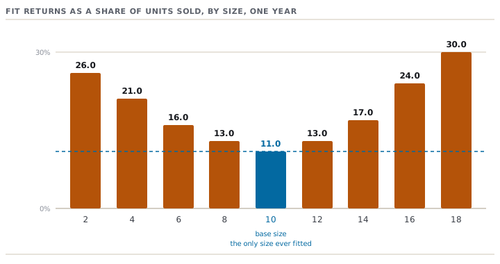
The shape is the finding. Fit returns are lowest at size 10 and rise in both directions. Size 18 comes back for fit at 30.0% against the base size's 11.0% — 2.73 times the rate. The four sizes at the ends of the range are 26.0% of everything sold and 39.19% of every fit return.
Ostley pays USD 11.40 to handle and ship back one return. So fit returns alone cost USD 397,643.40 in the year. USD 155,849.40 of that belongs to those four sizes.
Now put the two tables side by side. The chart is flat and the returns are U-shaped, and the bottom of the U sits exactly on size 10. Size 10 is the size Ostley fits its samples in. It is the size its fit model wears. It is the only size any human being has ever put on and commented about.
The five questions to ask of any chart
Tess's two days produced a short list of questions. Ostley now runs it on every chart it holds. It takes an afternoon and needs no budget.
- Which population, measured when, and how many people? A chart with no answer is a guess, not a specification.
- Is it a body chart or a garment chart? They look the same and they are different things. Lesson 3 shows how to tell by reading the numbers.
- In what posture and what state were the measurements taken? Standing, breathing normally, in what underwear, at what time of day. Lesson 2 explains why that matters more than it sounds.
- Has it been extended, and by whom? Sizes added to the top or bottom of a range by carrying the existing steps onward are the most common silent fault in a chart. Once the extension is typed into the grid, you cannot see it.
- What do your own returns and exchanges say about it? This one is free. You already collect it. And it is the only one of the five that tests the chart against real people rather than against a document.
Ostley could answer none of the first four. It answered the fifth in an afternoon, and the answer was the U in the diagram.
Prompt · Interrogate the size chart you inherited
The first time somebody asks whose bodies your size chart describes and nobody in the room can answer.
Act as an apparel technologist who builds body-measurement tables from measured data and has no stake in defending the chart in front of you. I want a provenance audit of a size chart, and I want you to be blunt about what it cannot support. Here is what I have. Category and market: [CATEGORY, MARKET, MEN OR WOMEN OR CHILDREN]. Sizes in the range: [LIST THEM]. The chart, pasted as a table with a row per size and a column per point of measure: [PASTE IT]. What I know about where it came from: [ORIGIN, DATE, WHO SUPPLIED IT, ANY SURVEY NAMED, ANY SIZES ADDED LATER AND BY WHOM]. Whether it is a body chart or a finished-garment chart, if I know: [ANSWER OR SAY UNKNOWN]. My own evidence, if I have it: units sold by size for a year, returns by size, return reasons by size, exchanges, alterations: [PASTE WHAT EXISTS]. Do the following. First, tell me whether this is a body chart or a garment chart, and say how you decided from the numbers alone rather than from my label. Second, compute the step between every pair of adjacent sizes at every point of measure, and give me the differences between the two main girths at every size in their own column. Say plainly whether the steps and the differences are the same at every size, and what that would mean about how the table was made. Third, name every place where the chart looks generated rather than measured, and every place a size looks appended to the end of a range. Fourth, take my returns or exchange data and give me the rate by size, plot the shape in words, and tell me whether the failures are flat across the range or gathered at the ends, and what each shape would mean about whether the fault is in the base or in the grade. Fifth, list the questions I should put in writing to whoever owns this chart, ordered by how much they would change my next decision. Sixth, tell me what you could not determine from what I gave you, and what single piece of data would resolve the most of it. Do not invent a population, a survey or a national standard to explain the chart, and do not tell me the chart is fine because it looks normal.
AI can make mistakes — check anything you act on.
What this course does with it
The rest of the course follows one style, OS-2214. It is a women's stretch-woven trouser in Ostley's twill, 24,000 units, made by Yatawara Apparel in Giriulla, Sri Lanka. The factory price is USD 12.40 FOB — free on board, the price with the goods loaded at the port of shipment — against a USD 79.00 shop price. It was developed digitally: a 3D pattern, virtual fit rounds on an avatar, a scan study behind the new chart.
Every one of those tools is good. None of them can tell you whether the chart underneath is true, because every one of them takes the chart as its input. That is the shape of the whole course: the digital toolchain amplifies the chart, and it cannot audit it.
Check yourselfYour fit-return rate by size is flat across the range at about 14%, with no U shape. What does that tell you, and what does it not?Show the answer
It tells you the grade rule is not obviously wrong. The sizes are failing at the same rate, so the error is not building up as the range moves away from the base size. It does not tell you the chart is right. A chart that is wrong in the same way everywhere — every size two centimetres too small in the hip, say — gives you exactly this flat picture, because the whole range has moved together and the failure rate does not depend on size. A flat 14% is evidence about the steps and silence about the base. To test the base you need the other measurement: what your customers actually are, which lesson 2 is about. A U shape points at the steps between sizes; the absence of one is not a clean bill of health.
What to take to your own chart
- Find out where your chart came from. Write down the answer, or write down that there is no answer. Both are useful and only one of them is comfortable.
- Plot fit returns, exchanges or alterations by size before you plot them by style. The style view hides the steps; the size view is the steps.
- Look at the difference column — hip minus waist, chest minus waist, whichever two girths your category uses. If it is the same at every size, the chart was generated rather than measured.
- Treat the base size's low return rate as expected, not as reassurance. It is low because it is the only size anybody has ever fitted.