Lessons · Lesson 2 of 6
- 01 · A colour is a measurement, and a measurement carries its conditions
- 02 · The screen is an emitter and the garment is a reflector
- 03 · Why a render can never disagree with itself
- 04 · A digital material is two halves, and one of them is usually missing
- 05 · The library nobody curates
- 06 · The library is a lead-time asset, and the unit is days
The screen is an emitter and the garment is a reflector
Decide which colour questions a display may settle and which it may not, and know what a calibrated screen is a precondition for.
Lesson 2 of 6 · 18 min
The situation
14 January, 14:00 UK time. Nine people join a call to sign off the autumn colour card. Four are in Skipton, two are at home, one is in Bhiwandi at Sundargarh Apparel, one is at Chandori Mills, and one is a freelance print designer. Everybody is looking at the same file. Everybody sees the same thing. Everybody agrees.
The card is signed off in fifty minutes, a third of the time it took last year. Six weeks later the dyehouse at Chandori Mills says Redwing Orange cannot be reached in the dye class the tech pack names, and asks what the real target is.
Nobody on that call was careless. The failure is in the physics, and it is one sentence long.
The physics, in one sentence
A screen makes colour by giving off light. A garment makes colour by taking light away.
A display starts black and adds red, green and blue light in whatever proportion the file asks for. A dyed cloth starts with whatever light falls on it, soaks up some of it, and sends the rest back. The two are opposite processes with opposite limits. Three consequences follow, and they decide how a digital studio works.
A display has a boundary, and cloth does not have the same one. The set of colours a screen can make is fixed by its three primary lights. Some colours a dyehouse can make sit outside it. Some colours a screen can make sit outside anything a dyer can reach on cotton.
A display's colour depends on the display. The same three numbers drive two monitors to visibly different colours, because their primaries, their brightness and their response curves differ. A profile is a file that records that difference, so the system can correct for it. Without one, a file's numbers are instructions to a device nobody has measured.
A display's colour also depends on the room. A screen is a light source competing with the light already in the room, and light bouncing off the front of the panel adds to what the panel gives off. A window behind a reviewer, a coloured wall, a desk lamp: each changes what that reviewer sees from a file the sender cannot control.
That third point is why a screen judgement is a two-part condition rather than a one-part one. The display has to be measured, and the viewing room has to be controlled. There is an international standard for the second half, and it exists precisely because comparing a display with a physical sample was found to need both.
What actually happened to Redwing Orange
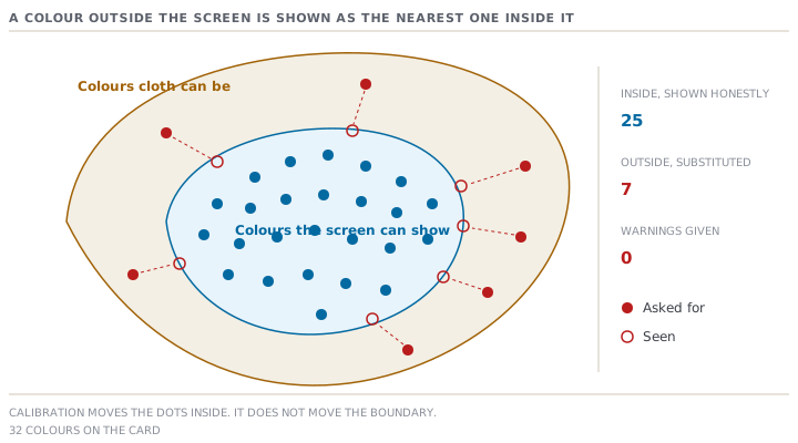
Of the 32 colours on the card, 25 sit inside what the studio's displays can make. 7 — 21.9% of the card — sit outside it. Redwing Orange is one of the 7, along with two other saturated warm shades and a bright green.
Here is the part that makes it a trap rather than a mistake. When a colour falls outside a display's range, the display does not warn anybody. It shows the nearest colour it can make, quietly and consistently. So all nine reviewers saw the same substituted orange, agreed with each other about it, and recorded an approval. They got consistency without accuracy. That is exactly what a shared file guarantees, and exactly what nobody on the call thought they were testing.
The four reviewers with profiled displays and the five without were in the same position on this colour, which is worth saying plainly: profiling does not make the boundary bigger. A measured display shows out-of-range colours more honestly, because the substitution is made deliberately by the colour management system rather than accidentally by the panel. But it still cannot make a colour it cannot make. Calibration fixes the colours inside the boundary. Nothing fixes the ones outside it.
| Reviewer group | Displays | Profile made recently | What their agreement was worth |
|---|---|---|---|
| Skipton studio | 4 | 4 | Comparable to each other, and to the file, for colours inside the range |
| Home and remote | 3 | 0 | Comparable to nothing. Two of the three had a window in shot |
| Factory and mill | 2 | 0 | Comparable to nothing, and both were on laptops in a lit office |
The boundary, written as a rule you can apply
The useful output of this lesson is not "calibrate your screens". It is knowing which question a screen is allowed to answer.
A display may settle a relative question. Is this colour the same as that colour, in the same file, on the same screen? Do these colours work together? Is this shade warmer than the one we used last year? Has the print repeat gone wrong? Each of these compares things inside one image, where the display's errors apply equally to both sides and largely cancel out.
A display may not settle an absolute question. Is this the colour we are buying? Does this bulk match the standard? Will this dyehouse be able to reach it? Each of these needs the colour to be right in itself. A screen cannot deliver that for a colour outside its range at any calibration, and it cannot deliver it for any colour at all on an unmeasured panel in an unknown room.
There is a third group worth naming, because it catches people who have accepted the first two. A display cannot settle any question where the surface matters. A colour on a matt brushed cotton and the same colour on a shiny sateen are the same measured colour and look like different colours. The cloth's surface changes how much of the light comes back as a highlight rather than as body colour. Lesson 4 is about the material data that carries this, and it is not colour data.
What it cost, and what the fix costs
Redwing Orange went to the mill on the strength of the sign-off. The dyehouse's first submission came back visibly wrong. The second was the dyer asking what the target actually was. The colour needed two extra rounds before a standard existed that both sides could work to. On this brand's calendar a round is 12 days, so that is 24 days of elapsed time. It also used up two of the buyer's colour-room slots, in a season where those slots are the binding constraint. Lesson 6 does that arithmetic.
Against it:
| What | Cost | How often |
|---|---|---|
| Profiling instruments, two of them, shared across the studio | USD 530 once | Bought once |
| Re-profiling every display | 12 minutes a display | Monthly |
| The nine displays, monthly | 1.8 hours | Monthly |
| Listing the out-of-range colours before a sign-off call | Minutes | Per card |
| Judging those colours physically instead | A courier and a light box | Per card |
USD 530 and 1.8 hours a month is not a business case that needs making. The reason it does not happen is not cost. It is that nobody owns the screen. The studio owns the design, the technologist owns the standard, the IT department owns the hardware, and colour management sits in the gap between them.
Prompt · Decide what this screen may settle
Before any colour sign-off held on a call, and any time somebody asks you to approve a colour from an image.
Act as a colour management specialist with no interest in whether the answer is convenient. I need to know which of the decisions on tomorrow's call a screen is allowed to settle, and which have to be judged physically. Facts: the colours to be reviewed [LIST THEM, with the substrate each will be realised on], how each colour is held today [MEASURED FILE, COORDINATES, CODE, OR AN IMAGE], the reviewers and where each will be sitting [LIST], which displays have been profiled and when [LIST], whether the rooms are controlled and what is behind and in front of each screen [DESCRIBE], the file format and whether it carries an embedded colour profile [SAY WHICH], and the decisions the call is meant to reach [LIST THEM]. Do the following. First, split the decisions into three groups — relative comparisons a screen can carry, absolute colour judgements it cannot, and appearance questions where the cloth's surface decides and no screen can help — and say which group each decision on my list falls into and why. Second, tell me which colours are likely to fall outside a normal studio display's range, name the shade families that usually do, and say how I would confirm it from my own colour management system rather than by guessing. Third, tell me what a reviewer on an unprofiled laptop in a lit room actually contributes, and whether their agreement should be recorded at all. Fourth, give me the wording to open the call with, stating out loud which colours cannot be judged on screen. Fifth, list the cheapest changes in order — the ones that cost nothing today, then the ones that need equipment — and put a rough figure and a frequency against each. Where you are uncertain about my setup, ask rather than assume, and never tell me a colour is safe to approve on screen when the evidence for that is missing.
AI can make mistakes — check anything you act on.
Check yourselfEvery reviewer on the call has a recently profiled display in a controlled room. Which of the card's 32 colours can now be approved on screen?Show the answer
Still only the 25 inside the display's range, and even those only as a preliminary agreement rather than a colour approval, because approving a colour means approving a dyeing on a substrate rather than an image. What profiling has bought is that the 25 now look the same to everybody and look like the file. So the relative judgements are worth something: combinations, warm against cool, this season against last. The 7 outside the range are unchanged by any amount of calibration. A display cannot make them, so it substitutes, and it does so without saying it has.
Check yourselfA print designer sends a photograph of a strike-off and asks whether the ground colour is right. What do you answer?Show the answer
That the photograph cannot answer it, and then what would. A strike-off is a trial print run on cloth. A photograph of one adds a camera and a light source to a chain you already could not control, so the image tells you about the exposure at least as much as about the cloth. What it can settle is relative, and that is often the real question: has the ground shifted between the two strike-offs in the same frame, is the repeat right, has a colour dropped out. If the question is genuinely the ground colour against the standard, ask for the strike-off in the post and a measurement of it in the meantime. The measurement will arrive the same day and the cloth two days later.